Gift Viz is a prototype guide and workflow that aims to inform designers and developers about the possibilities and methods for producing insightful visualisations from the data their applications capture during their use.
Data Analytics are a proven boon to the industrial and commercial sectors. Every little bit of data can potentially be converted into useful information and actionable knowledge when you know what to look for. And the more data points there are, the more more knowledge can be garnered, even from seemingly insignificant bits of information. This has been shown to work well for commercial organisations of all sizes and types, and as we shall see it can be tremendously useful for cultural heritage and creative organisations as well.
The GIFT project has produced several digitally-enable experiences during its activities, these include live deployments at Tate, Brighton Museum, the Munch Museum and others. From each of these events considerable amounts of data have been gathered, some explicitly by design, and some because they were necessary for the workings of the apps and systems that enabled them. Data such as visitor numbers, the time and duration of the visits, the specific exhibit that were visited and the order it was done so, are all recorded. Richer data is also captured, especially when done so by design. The Emotion Mapper platform helped captured the feelings and opinions of the visitors during their visit to the Munch Museum, while the One Minute Experience and the Gift app contain dozens of data points about what exhibits visitors found inspiring during their museum visits.
But all this data, unless explicitly pursued, is usually left unused, sitting in a database somewhere, in a format that cannot be easily read and interpreted to gain any useful insights. This is where Gift Viz aims to intervene. Using our experience in creating and design interactive museum experiences, and our need to reflect on their performance, we have considered and developed ways of practically capturing and usefully presenting data from our lives deployments.
Visualisations such as those seen below, and available online to interact with here, are the product of the Gift Viz workflow, our method which outlines how designers and developers can prepare data for Network Graph based data visualisations that can provide quick insights into the workings and performance of your organisation and exhibits.
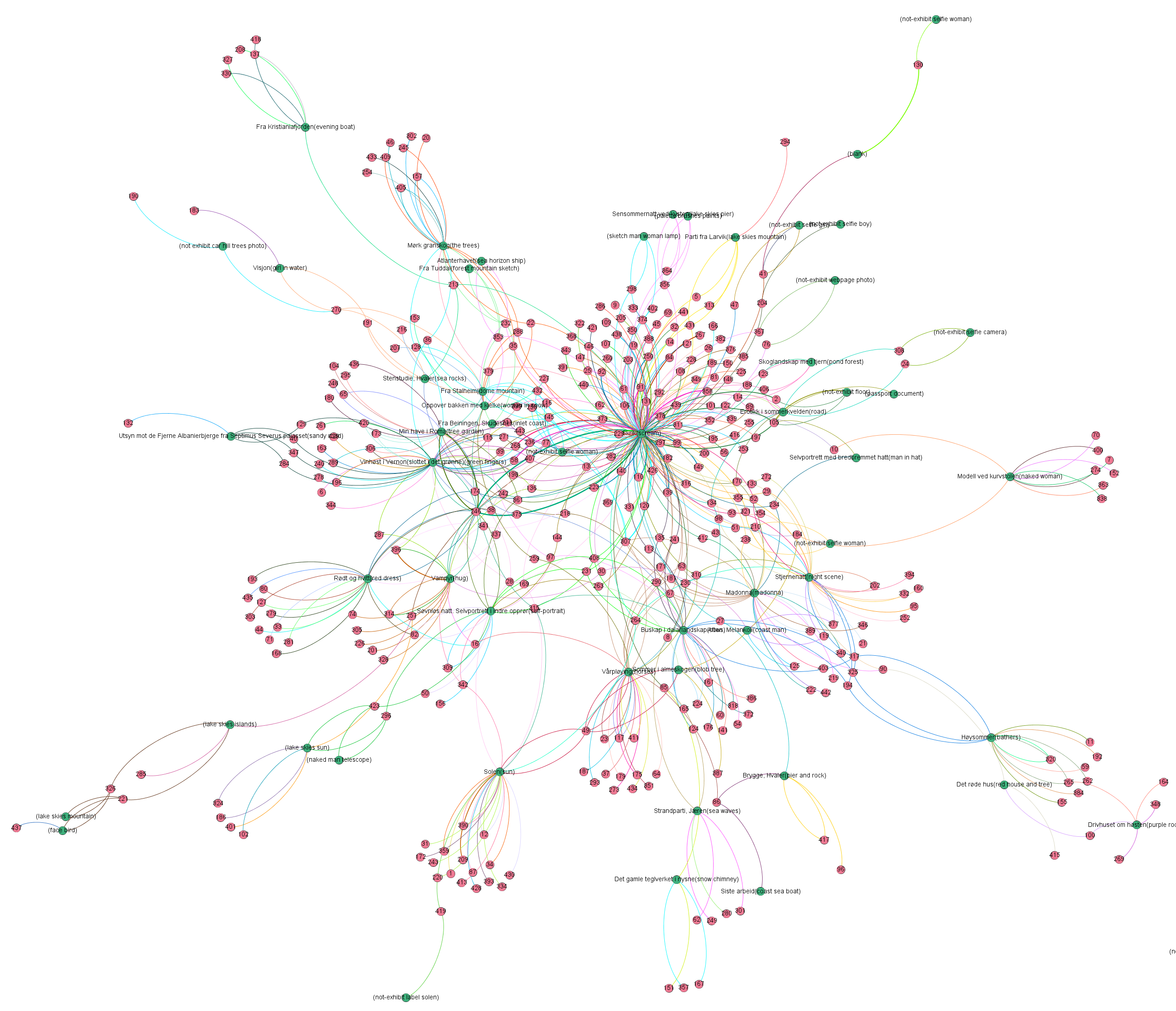
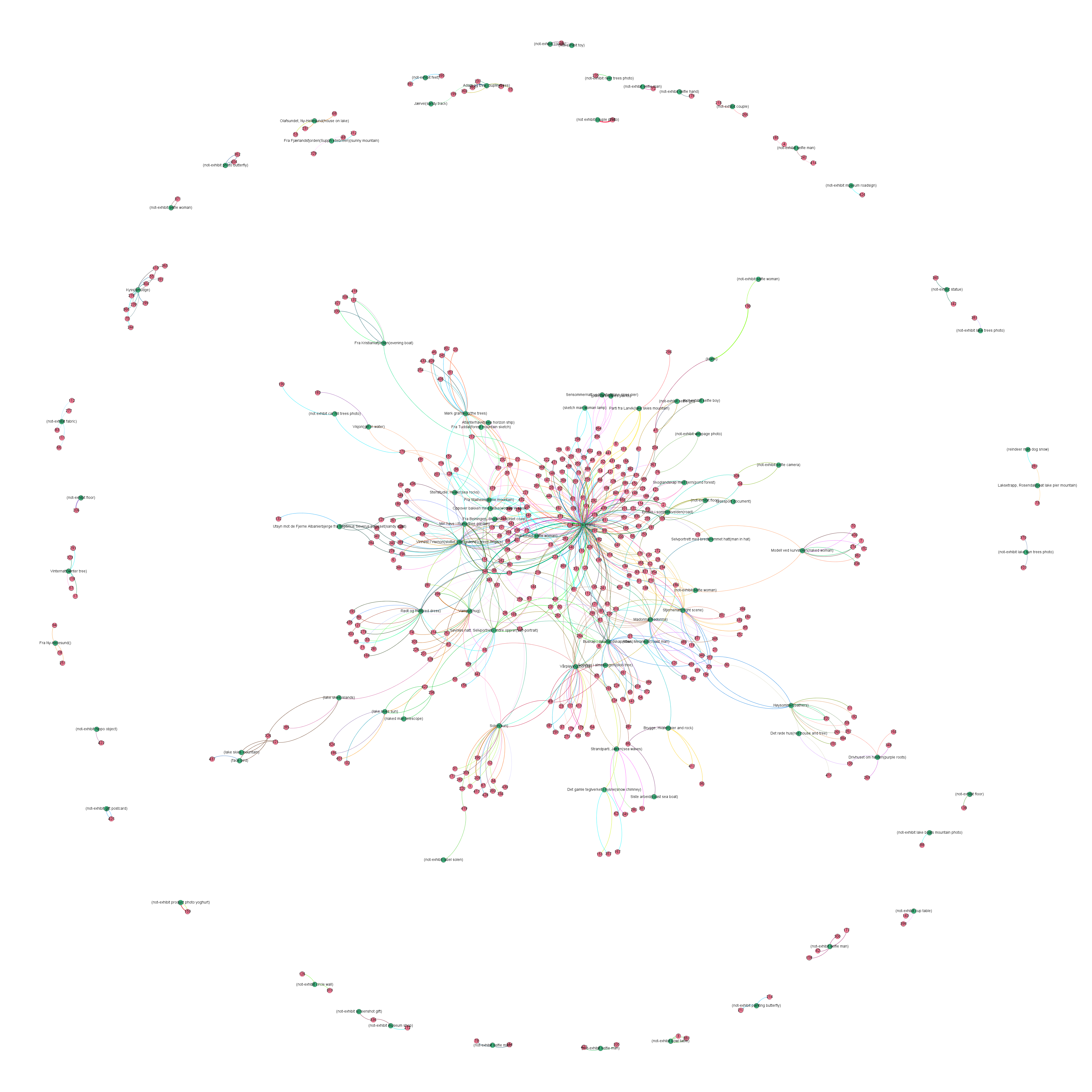
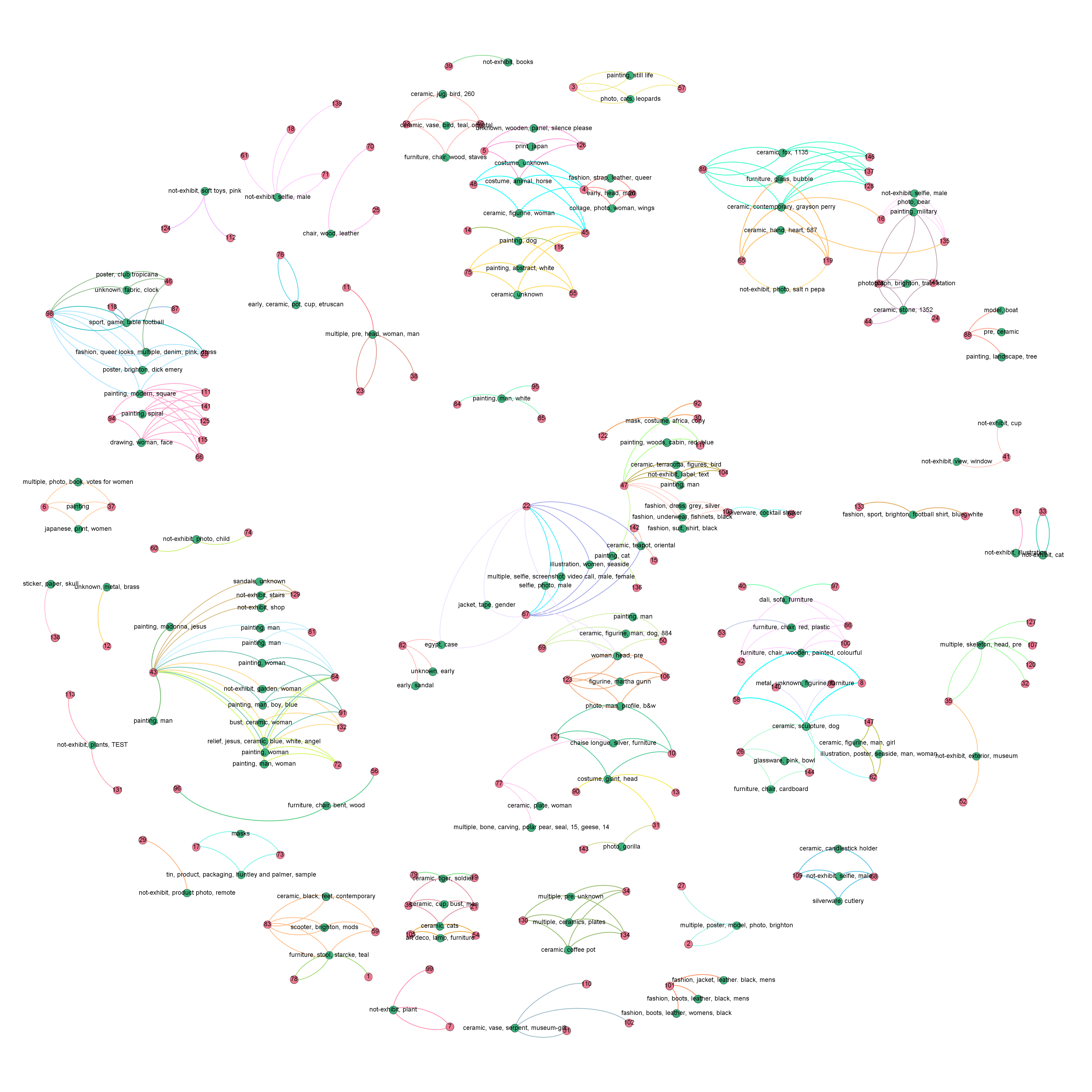
You can explore the interactive versions of these graph for the Brighton and Munch Museum deployments.
In the examples above the the red nodes represent the users of the GIFT app, who created exhibit-based gifts, represented by the green nodes, which they consequently gifted to other users. The network graph visualisations allow app and museum managers to derive complex insights from these activities at a glance. They can easily sport the most active users and the most popular exhibits. These way they can react to the visitors activities and preferences.
Gift Viz is currrently under active development. If you would like to discuss how you too can incorporate similar data analysis and visualisation production capabilities to your designs please get in contact with us at Dimitrios.Darzentas@Nottingham.ac.uk or Edgar.Bodiaj@Nottingham.ac.uk